AI-assisted monthly close
Truewind. AI Agentic Sass
Prototype
Truewind is an automated accounting platform that pairs AI agents with human review to close the books faster. Today, closing the books means accounting teams manually reconciling transactions, chasing status across spreadsheets and tools, and repeating the same close checklist every month with no analytical value added. The challenge was building an AI system accountants would actually trust with financial data, in a domain where a wrong automated action has audit consequences.
My Role
Founding Product designer

Problem
Manual close process leaves accounting teams buried in work
Manual close workflows were disrupting accounting operations. Disconnected tools and a lack of real-time visibility created compliance risk, increased reporting cycle times, and inefficiency across every close. Accountants spent 40+ hours per close on manual process work, with no centralized view of what was done, what was pending, or what needed their attention.

Solution
An intelligent close where AI
proposes and humans decide
I structured the product around a Workflows → Tasks → Steps model so accountants always know where they are and what's left. Some areas I focused on:
Making AI thinking visible — showing what was matched and why, not just the result
Keeping people in final control — every automated action reviewed before it posts
Building trust incrementally — visibility first, then suggestions, then automation
Structuring every close the same way, so no two closes run differently again

Reducing manual work without sacrificing auditability
It was critical for accountants to move through hundreds of AI-proposed matches per close without missing the ones that mattered. The agent auto-matches the bulk of transactions and routes only the exceptions to a human-review step — so people spend their time on judgment, not repetition, and every action stays defensible at audit time.


A system built for trust,
not just consistency
I established the design patterns and principles for the platform, status, priority, review states, audit history, so an accountant can tell a workflow is reliable before they've read the detail. In a tool making financial decisions, consistency is what earns trust

Take Aways
Trust is a design problem
Accountants didn't distrust the AI because it was wrong often, they distrusted it because they couldn't tell when it might be wrong. Making the reasoning visible mattered more than making the AI more accurate. Investing early in transparency and human-control patterns was what let the automation ship at all.
Time to close books
50%
reduction in time to close books.
Behavioral Impact
35%
fewer manual reconciliation errors.
HealthEquity, Unified platform
The HealthEquity participant platform enables employees to efficiently manage their Health Savings Accounts (HSA), Flexible Spending Accounts (FSA), Commuter and other pre-tax benefit programs. Today this is a fragmented experience across multiple legacy systems that serve 20+ million members. The challenge is to create a unified seamless experience that builds trust and reduces friction.
My Role
Product designer
Lead software architect
Prototyping

Problem
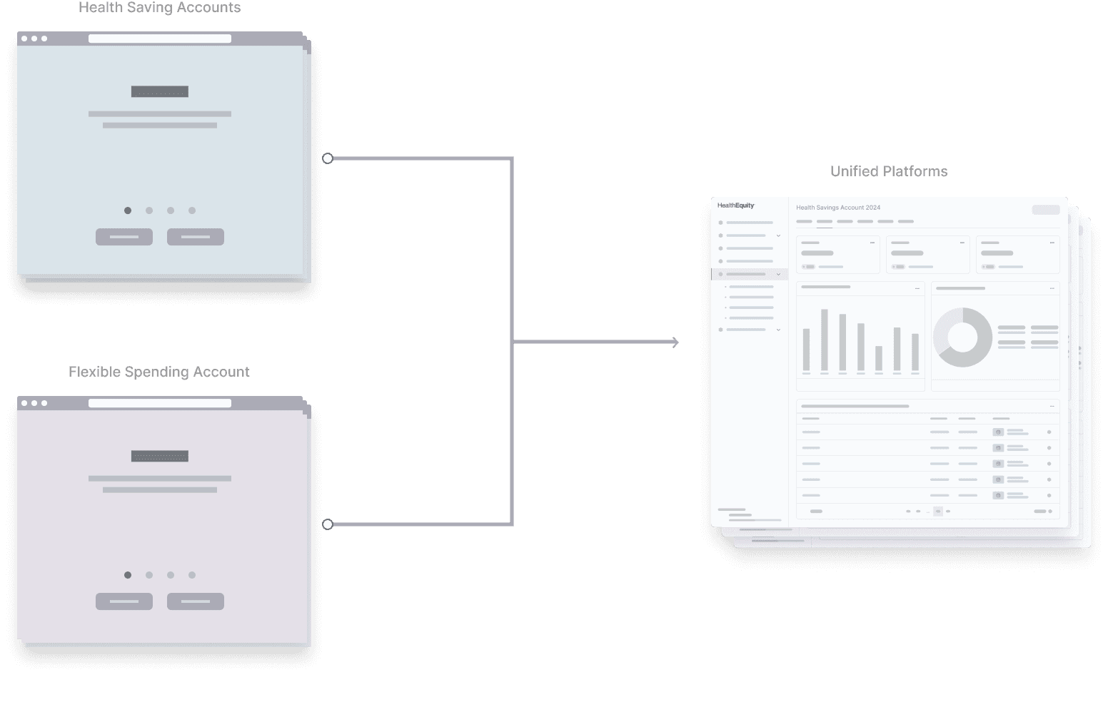
Fragmented experience across
multiple products
With the HealthEquity and WageWorks merger, the team was tasked with creating a unified participant experience. In order to move fast the MVP was a central dashboard which linked the existing legacy applications. The solution still needed to address the entire experience across HSA, FSA, and Commuter platforms. The current fragmented experience lacked basic usability standards, disrupted common task flows and created confusion. This was a frustrating experience and led to an increase in support calls.
Challenge
A unified platform that is scalable, flexible and consistent
Our challenge is merging various web applications into a cohesive user experience. To address this, I focused on:
Unifying the design language and user interface across all applications
Streamlining navigation for easy access to essential features
Conducting user research to identify pain points and preferences
Iterative testing to refine and validate the design
Solution
A unified platform that is scalable,
flexible and consistent
During the design phase I restructured the overall architecture to provide a seamless user experience for all major products in one platform. Some areas I focused on:
Merging products like HSA, FSA etc using a user centric strategy
Simplifying the overall navigation
Ensuring scalability across different accounts
Making it easy for both new and existing customers

Reducing friction, de-duplication and
creating efficient workflows
It was critical for users to complete various tasks across multiple products without needing to switch between different accounts. Our strategy would streamline the enrollment process across various, allow participants to effortlessly access and register in many offerings available, ensuring a smoother and more user centric experience.

A modular and scalable design system that builds trust and familiarity
I established the design system and principles for the entire platform to create a consistent experience for our users. This was essential to build trust, reliability, familiarity and connect multiple products. It was created in collaboration with engineering to ensure efficiency in development as the platform evolves with growing needs.
Take Aways
Incorporating user feedback throughout our design process helped us get a better understanding of current gaps, needs to create efficient workflows. Investing time and resources in foundational efforts and a design system are critical to ship efficiently, faster without sacrificing on quality.
Success matrices
Time for user enrollment and claim filing should be less than 80%
Positive rating with new experience should be more than 90%
Support tickets should reduce more than 25%
HealthEquity, Unified platform
The HealthEquity participant platform enables employees to efficiently manage their Health Savings Accounts (HSA), Flexible Spending Accounts (FSA), Commuter and other pre-tax benefit programs. Today this is a fragmented experience across multiple legacy systems that serve 20+ million members. The challenge is to create a unified seamless experience that builds trust and reduces friction.
My Role
Product designer
Lead software architect
Prototyping
HealthEquity. Web application
Problem
Fragmented experience across
multiple products
With the HealthEquity and WageWorks merger, the team was tasked with creating a unified participant experience. In order to move fast the MVP was a central dashboard which linked the existing legacy applications. The solution still needed to address the entire experience across HSA, FSA, and Commuter platforms. The current fragmented experience lacked basic usability standards, disrupted common task flows and created confusion. This was a frustrating experience and led to an increase in support calls.
Challenge
A unified platform that is scalable,
flexible and consistent
Our challenge is merging various web applications into a cohesive user experience. To address this, I focused on:
Unifying the design language and user interface across all applications
Streamlining navigation for easy access to essential features
Conducting user research to identify pain points and preferences
Iterative testing to refine and validate the design
Solution
A unified platform that is scalable,
flexible and consistent
During the design phase I restructured the overall architecture to provide a seamless user experience for all major products in one platform. Some areas I focused on:
Merging products like HSA, FSA etc using a user centric strategy
Simplifying the overall navigation
Ensuring scalability across different accounts
Making it easy for both new and existing customers
Reducing friction, de-duplication and
creating efficient workflows
It was critical for users to complete various tasks across multiple products without needing to switch between different accounts. Our strategy would streamline the enrollment process across various, allow participants to effortlessly access and register in many offerings available, ensuring a smoother and more user centric experience.
A modular and scalable design system that builds trust and familiarity
I established the design system and principles for the entire platform to create a consistent experience for our users. This was essential to build trust, reliability, familiarity and connect multiple products. It was created in collaboration with engineering to ensure efficiency in development as the platform evolves with growing needs.
Take Aways
User Insights for Growth
Incorporating user feedback throughout our design process helped us get a better understanding of current gaps, needs to create efficient workflows. Investing time and resources in foundational efforts and a design system are critical to ship efficiently, faster without sacrificing on quality.
Claim submission time
50%
of users saw reduced claim submission time by 50%
Behavioral Impact
70%
Fewer errors in submissions, leading to faster claim approvals.
Take Aways
Incorporating user feedback throughout our design process helped us get a better understanding of current gaps, needs to create efficient workflows. Investing time and resources in foundational efforts and a design system are critical to ship efficiently, faster without sacrificing on quality.
Success matrices
Time for user enrollment and claim filing should be less than 80%
Positive rating with new experience should be more than 90%
Support tickets should reduce more than 25%